VERNACULAR PICTURES 8: KOUSHI

Continuing on somewhat from last week’s post on the filtering functions of the building envelope, here I would like to consider the Japanese koushi: the timber lattice covering the (usually front) windows of Japanese townhouses.

View of the street through the koushi from within the entrance of a townhouse.

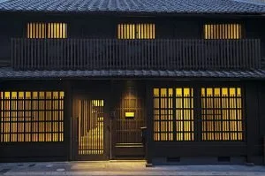
View of a koushi-covered facade at night.

The koushi is a great example of the ‘subspecies’ that arise within any element or ‘species’ of vernacular architecture, evolving over time via a process of functional and regional differentiation. The generic koushi has several basic functions: to provide security against forced entry, and to grant the inhabitants some privacy from prying eyes (although privacy was not really a concept in pre-modern Japan, nor one for which the Japanese language even had a word: today they use the English transliteration puraibashii). Aesthetically, koushi provide a sense of verticality to windows that are generally in a ‘landscape’ orientation, and adds rhythm and fractal detail to an otherwise fairly unornamented facade.

A fine koushi showing one of many patterns of cutting the ‘slats’ short at the top to admit more light without compromising on privacy.

Koushi consisting of alternating stout, full-length members with shourter, finer members.

Machiya townhouses containing valuable commodities like alcohol (sake) had the stoutest koushi, called sakaya ‘sake shop’ koushi. Likewise, rice shops (komeya) had komeya koushi, with thick, roughly dressed members that could withstand impacts from wayward barrels of rice and shrug off any scratches and dents. Charcoal shops (sumiya) had sumiya koushi, with very wide, closely-spaced slats, to prevent breezes and drafts from stirring up carbon dust inside the shop. Silk-weaving premises (itoya) and other industries involved in precision craftwork had thin, widely-spaced itoya koushi, to allow in as much light as possible.

Examples of some of the most common types of koushi. From left to right: itoya koushi, sumiya koushi, sakaya koushi, and komeya koushi.

Koushi have become something of a lazy cliche or trope in modern architecture, both in Japan and the West. A common modern abuse or misuse of koushi is to use them in front of blank walls, or to partially obscure things which would be better off completely hidden.  Traditional koushi draw the eye and entice the attention because they are always in front of something worth looking at, i.e. a garden (possibly welcome attention), or a front room (probably unwelcome).  Modern ‘decorative’ koushi on blank walls would have baffled carpenters of old. 

A modern Japanese example of koushi: frameless; consisting only vertical elements all identical in length, dimension, and setback; and arbitrarily covering both windows and blank wall.

Modern or modernist koushi are also almost always without a perimeter frame and lacking any of the subtlety imparted by varying the length, dimensions, or setback of the vertical members.  There are aesthetic (“It looks more sleek and modern!”) and no doubt economic motivations for this simplified form, and it can be effective, but rarely. 


BUILDING ENVELOPES AS FILTERS

The envelope of a building can be thought of as an assembly of filters, with each filter allowing, and preventing, a particular set of elements from passing through it. These elements might include heat, cold, light, radiation, water, moisture, rain, snow, air, drafts, breezes, fire, embers, smoke, views, sound, noise, strangers, children, burglars, pets, farm animals, insects, smells, dust, pathogens, toxins, vehicles, or projectiles. The strongest filter is a thick concrete bunker wall; the weakest is a large opening without door or glazing.

Many of the filters in buildings are operable or ‘tuneable’ to some extent, the most obvious examples being doors and windows. In most Australian houses, the conventional filter arrangement for windows is an openable, clear-glazed sash, with a flyscreen which may be fixed or openable/removeable. Flyscreens are considered essential to keep flies out in summer, and mosquitoes out at night - in other, malarial places, the ‘insect filter’ might be brought within the envelope, in the form of a mosquito net over the bed.

So the conventional filtering options for a window are: with sash closed, admitting light and view but excluding air, smells and most sound; with sash open, admitting light, view, air, sound and smells. Adding some combination of blackout curtain, lace curtain, and/or blinds gives you additional control over light and views.

There are other, less conventional ways of arranging the filtering functions of a window: you might have two-part windows, for example, with one part fixed glazing and the other part an insect-meshed opening fitted with an operable shutter. The advantage of this arrangement is that it avoids the expense and complexity of a modern operable glazed sash, and can be constructed DIY without too much skill or trouble.

Glass is something of an illusory material in that it gives the impression of openness, but in fact a closed window, while it admits light and view, filters out a great deal else, and largely excludes the exterior from the interior in the sensory sense. A house with an envelope consisting almost entirely of floor-to-ceiling fixed glazing is much less in contact with the outside environment than a house which is all solid wall other than for a single unglazed opening.  This isn’t necessarily a bad thing: in unpleasant environments, the ability of glass to divide light and view off from the other senses is often desirable, and one we take for granted.

In contrast, the semi-opaque paper-covered shoji of traditional Japanese dwellings admit light and sound but not view, and their solid timber amado shutters prevent sound to a degree, but exclude light. You cannot have light without sound, and you cannot have vision (view) without the other senses: smell and touch (breezes) and, in winter, cold. Again, the filter is brought within the building envelope, in this case in the form of warm clothes.


VERNACULAR PICTURES 7: EARLY AUSTRALIAN VERNACULAR

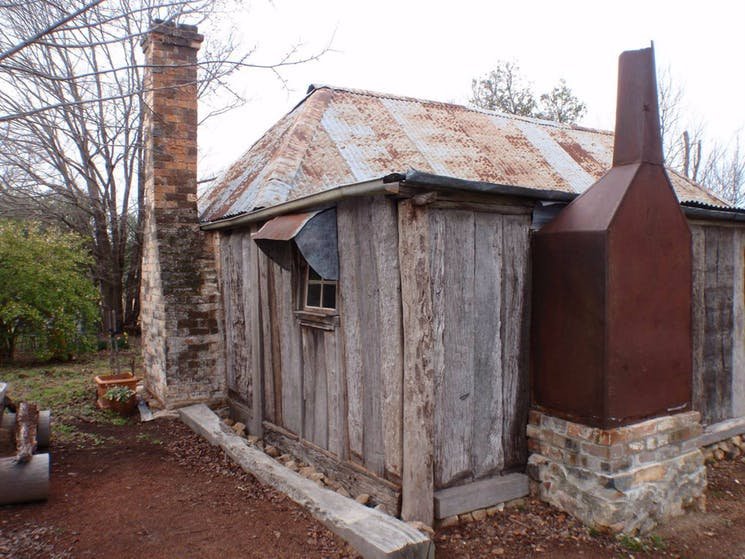
The early cottages and huts of Australia’s pioneers and settlers have great charm and appeal. Their primitive, at-hand materials - bark and log or corrugated iron roofs, timber slab walls sometimes rendered in clay or lime, and the characteristic ‘standoff’ chimneys, with flues also often constructed in timber and bark - soon gave way to more refined options once they became available, but the basic form - small, rectangular and compact, a central entrance and hall with a room on either side, steep gabled or hipped roofs - survived into the 20th century in both rural and urban contexts, as the workers cottages and miners cottages so popular in inner suburbs today.


VERNACULAR PICTURES 6: TENSILE STRUCTURES

Tensile structures are extremely rare in traditional architecture, because the most common traditional materials of that architecture - stone, brick, and mud - have almost no tensile strength. Timber is the exception, but even timber is relatively weak in tension, and has traditionally been used either under pure compression (posts and columns) or under bending (beams, lintels, joists, and rafters), where the tensile strength is a component of bending strength. Timber trusses, which contain members in pure tension, are a relatively recent invention, and rely on quality metal fixings at the nodes. Large-scale tensile structures didn’t become feasible in architecture until the appearance of quality steel, in the form of truss members and cables.

Traditional and even contemporary buildings are almost all compressive, and all extant ancient buildings are too, because only compressive structures endure. The pyramids of Egypt are the standout example, and owe their extreme longevity to the maximal stability of their form- a pyramid is really just an organised pile of rocks, tapering from base to apex, at or near the angle of repose.

In contrast to the inherent stability of compression structures, tensile structures are inherently unstable; or rather they have a dynamic stability, which is part of their aesthetic appeal. They are less suited to fixed buildings than they are to portable or ‘velocity’ structures where lightness is important- think sailboats, early aeroplanes, bows, and bicycles.

There is one traditional architectural tensile structure, however, that shares the same attributes as these non-architectural tensile structures: the tent. Indeed, tension and tent (and many other English words like tendon and tendril) come to us from the same root: the proto-Indo-European ten-, meaning ‘to stretch’. Tents make use of the few ‘contrary’ traditional building materials that excel in tension but have no compressive strength - fabric, hide, cord, and rope - in combination with economical use of compression elements such as poles.

Perhaps because of their ephemeral nature, tents get far less attention in the architectural world than the more solid and long-lasting building typologies constructed in stone or brick or even timber. Probably the best-known vernacular tent type is the ‘black tent’, whose traditional distribution stretches from North Africa to Central Asia; tents of this type are still in common use by the nomadic groups of these areas. The more famous Mongolian ger and Central Asian yurt are arguably not true tents, at least not in the structural sense, since the ‘skin’ is just a veneer hung over timber lattice walls and a timber rafter roof.

Black tents are perfectly suited to the hot, dry, windy desert climates in which they are found. Black may seem an ill-advised choice of colour, but it gives the fabric greater longevity against UV radiation, and also serves to create a vertical temperature differential in the tent, drawing air through it from the bottom to the ridge. The density of the fabric weave means that under normal conditions, air (but not sand) can pass through the fabric itself; on the rare occasion that it rains, the threads swell up to become more watertight. The walls of the tent can be opened or closed depending on the conditions, and the low-slung form allows the tent to stand against ferocious wind and sand storms.

The traditional method of repairing the fabric of the black tent is somewhat poetic and almost biological: when the strips of fabric closest to the ground are frayed beyond repair by wind and sand, they are removed, but not directly replaced; instead, the two sides of the tent are unstitched at the ridge, the two new strips are inserted there, and the two sides are stitched back together, so that each strip, newer than the strip below it, moves down one position in the wall, until it eventually reaches the bottom and is removed in its turn.


VERNACULAR PICTURES 5: SPOLIA

Spolia (from the Latin ‘spoils’) is the name given by architectural historians to (typically stone) fragments of earlier buildings that have been repurposed to serve as part of later buildings.

In the west, spolia are probably most closely associated with the period spanning the late Roman empire and the early middle ages- a period of decline in resource availability and technical ability, in which scavenging older or derelict buildings for building materials was common.

The practice is a good illustration of the writer John Michael Greer’s theory of ‘catabolic collapse,’ which uses the analogy of biological metabolism to explain the life-cycles of human civilisations. When civilisations are on the rise, they grow in an ‘anabolic’ manner, whereby ‘cheap and easy’ energy is consumed to combine simple elements into more and more complex structures, just as the human body transforms dietary proteins and energy into muscle. When energy is no longer cheaply or easily available, civilisations enter their decline and collapse phase, and their complex structures are broken down via ‘catabolic’ processes into simpler elements in order to unlock the energy and resources they contain, just as a starving organism will cannibalise its own muscle to meet its energy requirements. Think of the energy inputs, technical expertise and apparatus needed to produce and distribute even something so seemingly simple as dimension lumber, and then to assemble it into the form of a house; compare this with the act of pulling the house down and burning its timber to stay warm.


VERNACULAR PICTURES 4: PAINT AS ORNAMENT

One objection that is sometimes raised against the possibility of resurrecting ornament in modern architecture is the expense of it, whether real or perceived. However, the residential vernacular architecture of the world presents us with many examples of one possible solution: using paint to ornament or decorate buildings that are otherwise plain (i.e. lacking in fractal scales). A few examples are presented below.

The counter-objection against introducing this practice into our own building is that, just as we no longer have a genuine vernacular architecture, we also no longer have a shared vocabulary of unconscious, communal folk images or motifs to draw from; indeed, we no longer have a folk culture at all.

We do however have a precedent for what widespread ‘exterior decoration’ would probably look like in the modern context: the mainstreaming of tattoos. Instead of the ‘variety within uniformity’ and symbolic/ritual significance of say traditional Polynesian or Ainu tattoos, or even of underworld or sailors’ tattoos, tattoos in our own society are simple self-expression; everyone is free to pick and choose designs and styles from every era and every area of the world, or to make up something ‘unique’ according to their own imaginative whims. Imagine the architectural equivalent of this: houses with LIVE LAUGH LOVE and other inspirational slogans written in big bold letters across their facades.

But there is still a lot of potential in the idea of painted ornament in a modern setting, and there’s no reason it shouldn’t be one of the architect’s tools of the trade, to be at least considered if the circumstances suggest it and the conditions are right.


VERNACULAR PICTURES 3: LOG AND PLANK CONSTRUCTION

I’ve never been a fan of log cabins, at least not the sort most people associate with the name, where large diameter logs are left ‘in the round’ and stacked up by notching them out near their ends and interlocking them in alternating rows at the corners:

To me the effect is both crude and kitsch at the same time. But when the logs are squared off, or dressed into planks, and especially so when the gaps are plastered, ‘log’ cabins become a different thing entirely- they have the right balance of rusticity and sophistication, and you can easily imagine them being integrated into a ‘modern’ design very effectively.


VERNACULAR PICTURES 2: STEPPED GABLES

Stepped gables, or crowstep gables, are a form of gable wall where the parapet (the part of the wall that extends above the roofline) is stepped down from ridge to eaves, resulting in a number of horizontal sections. When the gable end of a building forms the building’s facade, stepped gables give a pleasing rhythmic quality to its appearance. Apart from this aesthetic consideration, stepping the gable removes the need for cutting bricks or stones to the angle of the roof, and the stepped parapet also serves as literal steps, allowing chimneysweeps or roofers to gain easy access to the ridge. It is this function that offers a clue as to why stepped gables are characteristic of Northern European architecture - the colder climate means more rain and snow, which necessitates steeper roofs, which in turn means more difficult access. Stepped gables are also a common feature of traditional Chinese architecture, though typically with a much smaller number of sections, and with the gable wall forming the side rather than the facade of the building.

A streetscape of stepped gables in Belgium.

Belgium again.

A relatively stark example, lightened by the patterned storm shutters, richly ornamented oriel window, and scupture of a stag on the ridge.

Culross Palace, Scotland.

Three-part stepped gables on the sides of Chinese vernaluar buildings.

Another example of a Chinese stepped gable (here dividing the roof rather than ending it, so perhaps more accurately called a party wall or fire wall).

An interesting example of a European stepped gable which shares features of the Chinese variety: the steps of the gable are themselves pitched, and roofed with the same material (in this case slate?) as the main roof.


VERNACULAR TYPOLOGIES 1: THE OAST HOUSE

Building typology refers to the classification of buildings into types according to similarities in form or function. The building types that most often come to mind, and that typically receive the most scholarly attention, are the ‘high’, classical or formal building types: the temple, cathedral, castle, school; and later, with the coming of the industrial revolution, the railway station, factory, airport, and the like. But some of the most appealing and fascinating building types are vernacular: buildings whose form reflects a very specific function, a function which in turn is the result of a very specific set of local conditions relating to culture, climate, agriculture and the like.

One of my favourite vernacular building types is the English oast or oast house, a building consisting of two parts: a rectilinear one- or two-storey volume (the ‘stowage’) for the storage of freshly harvested hops, and an attached tower (usually round with a steep conical roof) for the drying of the green hops over a fire at the base of the tower. Obviously, oasts were only found in areas where the climate was suitable for large-scale hops production; they are most closely associated with the counties of South East England, Kent in particular.

Today we might think these buildings look somehow ‘contemporary’ or ‘cool’, but that is to see them with a tainted eye. Their builders were innocent of such modern concepts, though no doubt they and the people who lived around these structures appreciated their effortless utilitarian beauty.


BUILDINGS WITH FACES

There is an idea sometimes encountered in modern architectural teaching and theory that it is somehow inauthentic or ‘fake’ to put more design effort, expense or ‘weight’ into the facade of a building than into the other sides; indeed, that a building shouldn’t even have a recognisably dominant side, but should rather be regarded and designed as a sculpture whose full profundity can only be grasped by a 360 degree walkaround. The paradigmatic example would be a building like Le Corbusier’s Ronchamp Chapel.

Ronchamp Chapel by Le Corbusier

Traditional buildings in such parklike settings, in contrast, whether cathedrals or country mansions, were always designed with a recognisable front. It was considered self-evident that buildings should have ‘faces’ just as people do, where expression and character are concentrated.

Villa Foscari by Palladio

At any rate, sites that allow buildings to sit visually unencumbered by any neighbouring structures have always been relatively rare, and are almost nonexistant in urban residential neighbourhoods. There is nothing inauthentic about putting more design time and money into a street facade, for example by using more expensive timber-framed windows only in the facade, and cheaper aluminium framed windows elsewhere. In fact, the classing of bricks into ‘common’ or ‘face’ varieties arose from this practice of favouring the front: the finest, most uniform and blemish-free bricks were graded ‘face’ quality, for use in the facade, and the rest ‘common,’ to be used on the back and sides of the building. Though the terms face and common brick survive to this day, the consistency of modern brick manufacturing has made the distinction almost meaningless, and the colour variation and visual interest displayed by ‘common’ brick is ironically often regarded as equally if not more attractive than the perfection and uniformity of ‘face’ brick, and used over the entire house.

The desire to give a building a pretty face should not be understood merely as an aesthetic custom or preference. It also has deeper social importance- it is a gesture to the street, and by extension symbolic of a willingness to engage with the public realm and the community.


TECHNOLOGY AND TRADITION

The period from the beginning of the industrial revolution through to the early 20th century is fascinating for the way in which architects and engineers were able to successfully adopt novel building methods, typologies, technologies, and above all materials - cast and wrought iron and later steel, Portland cement and reinforced concrete, and large panes of glass - into their buildings. But because they integrated these elements seamlessly into the unbroken lineage of traditional and even classical design idioms, rather than employ them in ‘radical’ ‘innovative’ and ‘challenging’ design ‘approaches’ as would be expected today, this long, fecund period has been somewhat memory-holed. Though it fits well into the history of building technology, in ideological terms it is on the wrong side of ‘year zero’ (whenever you define that to be) and it sits uneasily with the dominant contemporary narrative - that the current moment is somehow ordained; that the Modern is superior to the traditional and even represents a kind of ascent to a higher plane; that the break with and ‘leaving behind’ of the traditional was somehow inevitable and even morally necessary; that technological progress must necessarily go hand-in-hand with Progress as ideology, Progress in Theory and Progress in aesthetics; and that progress in such things is even possible.

Rather than be disheartened by the decoupling of material technology from traditional design, however, we should instead view the achievements of this period as a cause for optimism- after all, if it was done once, why shouldn’t it be done again?


VERNACULAR PICTURES 1: LOW CEILINGS

A big workload over the past week (and probably for the next month or so) hasn’t left me any time to write a proper post this week, but instead of breaking the streak I’m going to cheat for a while, and do a series of low-effort posts based around images and featuring some of my favourite themes, elements and designs.

To kick things off: low ceilings in vernacular architecture. Lowering the ceiling is not just a way of saving on construction materials and ongoing heating costs; it is also very effective in giving a space a sense ‘cosiness’ or intimacy, especially when a low ceiling is used within, and to give contrast to, a larger space with a higher ceiling, such as a dining nook in a kitchen or bed alcove in a bedroom. Arguably the four poster bed is an example of the latter in furniture form, with the roof of the bed forming a second ceiling below the room’s ceiling. If we permit this interpretation, then perhaps the ultimate in low ceilings and intimate spaces is the ‘box bed,’ once valued in the cold climates of northern Europe for its ability to trap heat, and no doubt also for the feeling of absolute enclosure and security it brought to its occupants.


ARCHITECT OR BUILDING DESIGNER - PART THREE

This post will be the last in our series on architects and building designers, and will elaborate on the conclusion to last week’s post - that a person’s status as architect or building designer is usually less relevant to the question of who to choose for you project than the suitability of the individual him or herself - by examining one of the most commonly held beliefs regarding the difference between architects and building designers: that architects are more expensive.

While this perception is in fact true in general, the difference in cost isn’t due to anything inherent to either occupation, but rather comes down to a) the scope of services and b) the ‘level’ or ‘depth’ of services historically and typically offered by each profession. As in most things, ‘you get what you pay for’ usually holds true, regardless of whether these services are offered by a building designer or an architect; and as mentioned previously, there is nothing preventing an individual building designer offering the same scope or level of services offered by a typical architect, or vice-versa.

In any case, what accounts for the difference in cost between one architect or building designer and another? When people speak of a building as ‘architectural’ or as having an ‘architectural’ quality, they are usually referring to a certain degree of refinement. This need not imply that an ‘architectural’ building must be modern in its design - traditional architecture, for it to work, arguably requires as great as if not a greater level of refinement and attention to detail than modern architecture.

In terms of the stages of the design process, the refinement of the design takes place mainly in two areas: firstly, in the sketch or concept design phase, in which it is expressed in the level of care and consideration given to the functional aspects of planning, and to the aesthetic and compositional basics of the building - the layout and interrelationships of rooms, overall massing of forms, scale and proportion, placement of openings, etc. Secondly, refinement is achieved in the detailing of the building. Detailing can mean anything from resolving the ‘joints’ of the building - the places where different planes or different materials meet - in an aesthetically pleasing way, to bespoke joinery, landscape design, exterior and interior materials and finishes, colour selection and coordination, lighting, furnishings, and the like.

It should also be noted that the further the designer departs from the norms of the building industry, or from ‘builder’s vernacular’ as it is sometimes called, the more research, consideration, and drawing will be involved, thus more time will be required, and this will be reflected in the cost.

The inclusion of contract administration in an architect or designer’s services can also have a significant effect on cost: in a full services contract, the contract administration stage can account for 25-35% of the designer or architect’s total fee. Contract administration is relevant to the concept of refinement in that it could be said that one important role of the contract administrator is to make sure that the building is ‘built as drawn and as documented’ - ensuring that the refinements made in the design and detailing stages are properly implemented in the construction stage, and not altered or omitted by a builder deciding that they are too much trouble or unnecessary.

ARCHITECT OR BUILDING DESIGNER - PART TWO

This is the second post on the differences between architects and building designers. Where the previous post focused on legalities, in this post I would like to look at the ‘flavour’ (for want of a better word) of each occupation, beginning with the education received by each.

As mentioned last week, an architect in Australia must have a three year undergraduate degree and a two year master’s degree in architecture. A building designer in Victoria, by contrast, must have an advanced diploma in building design (architectural), which takes at least two years to complete. As someone who holds both an Architecture degree (though not an Australian one) and an advanced diploma of building design, I would say that, in the broadest general terms, the focus of an architectural education is towards the ‘theoretical’, whereas that of the advanced diploma of building design is towards the ‘practical’.

The architectural education places a strong emphasis on being ‘creative’ and on ‘Theory’ with a capital T - it is heavy with concepts taken second or third-hand from modern academic literary and philosophical studies, such as such as deconstructivism, post-structuralism, etc. There is also an architectural history component, which is lacking in the advanced diploma of building design. A building designer’s education on the other hand is far more focused on the ‘nuts and bolts’ - the practical details of materials and construction, a working knowledge of the Building Code of Australia and the Australian Standards, bushfire attack level ratings, and so on. The building designer comes ‘out of the box’ more ready to go, if you like.

In the end, while it is certainly true that the work done by the typical architect differs from the work done by the typical building designer, the question ‘Should I engage an architect or a building designer?’ is probably the wrong question.  It would be better to ask “Who is the best person for the job?” Answering this requires answering some other questions first: What are my goals for my project, and who can best achieve them? What ‘style’ of building do I want? What level of detailing and finish do I want? What services do I require, and what do I want to pay for them? Does the person under consideration have the necessary level of experience, in the right areas, to undertake the job? Are their values, principles, and aesthetics aligned with my own? Do I like them and will I be able to get along with them over months or even years? Only once you have answered these questions will you be in a good position to choose the right person for your job, irrespective of their occupational status.


ARCHITECT OR BUILDING DESIGNER - PART ONE

What is the difference between an architect and a building designer?

This is a question I come across from time to time, both online and in the real world, and often in the context of a person wondering which they should engage to design, document, or administer their project. In this post and the next, I will try to answer it by examining the differences between the two occupations, and in the process (I hope) clear up some of the misconceptions and misunderstandings around the subject, since there is a fair amount of over-generalised, misleading and even inaccurate information floating around.

In answering the question, I will really be answering three questions: What are the legal frameworks, conditions and restrictions applying to each occupation? What services do each typically provide? and What services are each perceived to provide by the general public? Note that these questions pertain to architects and building designers as groups, rather than on a case-by-case, individual basis - this is an important distinction when considering the latter two questions, and one that we will return to later.

First, architects. In Australia, an architect typically must: have a three-year Bachelor’s degree in architecture and a two-year Master’s degree in architecture; have a minimum of two years full time experience working in architecture; pass the Architectural Practice Examination; be insured; and be registered with the architect registration board of the relevant state or territory (in Victoria this is the Architects Registration Board of Victoria or ARBV). There are other pathways to registration, but this is the path the great majority of Australian architects take. The National Standard of Competency for architects is determined by the national body, the Architects Accreditation Council of Australia or AACA.

The right to use the term “architect” is protected by law in Australia via various state and territory legislation; here in Victoria, the relevant act is the Architects Act 1991. Section 4 of this Act, Representing a natural person to be an architect, states that:

(1) A natural person must not represent himself or herself to be an architect and must not allow himself or herself to be represented to be an architect unless he or she is registered as an architect under this Act.

Section 7 When is a person or body represented as an architect? goes on to state:

(1) Without limiting the ways in which a person or body can be considered to be represented to be an architect, using any of the following titles, names or descriptions constitutes such a representation—

(a) the title “architect";

(b) any other title, name or description that indicates, or is capable of being understood to indicate, or is calculated to lead a person to infer, that the person or body is an architect or is registered or approved under this Act.

(2) Without limiting the ways in which a person can be considered to be represented to be an architect, a representation that the person provides the services of an architect constitutes a representation that the person is an architect.

“Architect” is not the only term protected by this Act. Section 8 Restriction on use of particular expressions states that:

(1) A person or body (other than a person who is registered as an architect under this Act or an approved partnership or an approved company) must not use any of the terms “architectural services", “architectural design services" or “architectural design" in relation to—

(a) the design of buildings or parts of buildings by that person or body; or

(b) the preparation of plans, drawings or specifications for buildings or parts of buildings by that person or body.

The term “architecture” is not explicitly listed in the Act as a protected term; Section 7 (1)(b) seems to suggest, however, that if building designer Bill Smith were to call his practice “Bill Smith Architecture” he might fall afoul of the Act. This raises the question of what distinguishes “architecture” from mere buildings, and makes one wonder how the question might be settled were it ever tested in court. Is a building designer with a portfolio of nothing but the most cutting-edge contemporary “architectural” design permitted to call it architecture? Is a utilitarian shed architecture simply by the fact of its having been designed by a registered architect? The formal designation given by the Victorian Building Authority for the category of work done by building designers is “Building Design (architectural)”, which would seemingly place the VBA in contravention of the restrictions placed on the use of the term “architectural” in the Act!

The status of building designers in Australia is somewhat more complicated and less clear than that of the architect, as there is no national body governing building designers, and minimum educational and qualificational requirements (if any) for building designers differ by state and territory - although the trend is towards more regulation and a national-level legislative framework may emerge at some point in the future. In Victoria, the governing body for all building practitioners (including building designers) is the Victorian Building Authority (the VBA). In order to practice, building designers in Victoria must: hold an Advanced Diploma of Building Design (typically two years’ full-time study); have at least two years’ practical experience in the field; have their ability and experience assessed by the VBA; and hold professional indemnity insurance.

This concludes our legal overview of and comparison between the two occupations, in answering the first of the three questions posed at the beginning of this post. What I hope it has demonstrated, and what I would like to emphasise, is that there is no part of the design process that an architect is permitted to do that a building designer is not. In particular, contract administration is often thought to be a service offered exclusively by architects, and sometimes incorrectly believed to be their legal preserve - in fact, there is nothing legally preventing building designers from offering contract administration services, and many do so.

In the next post, I would like to consider the second and third of the questions posed, by looking at the differences in education received by building designers and architects, and the various factors that come into play when deciding whether an architect or building designer is the right choice for your project.

 

KITCHEN LAYOUTS

In last week’s post we looked at the idea of applying the kitchen triangle in designing a kitchen, but noted that, while still a useful idea, developments in kitchen design in the 70 or so years since the concept was introduced have complicated things somewhat. In this week’s post we will examine some of these developments, and look at the influence they have had on kitchen design.

Perhaps the biggest change has been that the kitchen has taken centre stage in the social life of the house. With the rise of the informal Living-Dining-Kitchen plan, the importance of the kitchen within this open space has only grown, and so has its size. Often a central consideration in kitchen design is laying out the ‘stations’ of the space in a way that allows social interaction between the person or people doing the cooking and other family members ‘hanging out’ in the space.

One consequence of kitchens getting larger is that the idea of a kitchen triangle is not always applicable. Whereas in the past the kitchen was more or less exclusively the domain of the housewife or even a paid cook, in many modern households there may be multiple people involved in food preparation, and if this is the case the kitchen has to accommodate them - often by dividing the space up into two or more zones, with separate areas for food preparation and/or socialising. The single-wall kitchen, the L-shaped ‘corner’ kitchen, and the U-shaped or C-shaped layouts, though efficient in their use of space for smaller kitchens, are not always amenable to use by multiple people, or to socialising. One way around this is to include a breakfast counter ‘peninsula’ as one leg of the L or U, with high chairs or stools, so people have a place to sit and talk with the person preparing meals/washing up etc.

The gold standard for a ‘social’ kitchen within a larger open plan space is the kitchen island. The island serves as both preparation area and entertainment area, and can be added to a single-wall kitchen to form a ‘galley’ kitchen, or to a corner kitchen. In both cases, the kitchen island opens up the possibilities for using the kitchen socially, by reorienting the space towards the living area, but if space is limited the kitchen island may not be a practical possibility - although you can get away with as little as 1.0m clear distance between your kitchen counters and kitchen island in a single-person kitchen, you need at least 1.2m if the kitchen is to be used by two people at once - enough for them to ‘sidle’ past each other - and at least 1.5m to allow people to pass each other without going sideways.


THE KITCHEN TRIANGLE

The kitchen triangle or kitchen work triangle is a simple rule of thumb useful in kitchen design, first developed by ergonomists in the mid 20th century, who wanted a way of measuring and maximising efficiency of movement (and thus minimising space and thus cost) between the three main centres or ‘stations’ of activity in the kitchen: food storage (the fridge and pantry), food preparation (the sink) and food cooking (the stove/oven). Generally the sink, the most used part of the kitchen, should be in the centre of the arrangement, i.e. between the other two stations. The idea is that if you draw a triangle with one of these three stations at each of its three corners, then the total length of the sides of the triangle should be between four to six metres (some sources cite five to seven metres or other figures). At any rate, anything less than the lower figure probably means your kitchen will be too cramped; and anything higher might suggest that your kitchen is probably going to be too large and you will be spending too much time and effort walking between the three stations.

The kitchen triangle is also useful in making sure that no pedestrian traffic crosses any part of the working space of the kitchen- people going through the kitchen to bedrooms, laundry, etc. should not have to cross paths with or dance around a person using the kitchen. Also, the lines of movement and sight between stations should ideally not be ‘broken up’ with tall cabinets, wall ovens, and the like- there should be open countertop between each station.

As a general rule of thumb, the kitchen triangle is still a valid way of evaluating the basic functionality of your kitchen, even seventy odd years after the concept was first introduced. Of course, each design situation and brief is unique, the kitchen triangle is not appropriate for all kitchens, and these days things like kitchen islands can complicate matters- next week we will look at some of these factors in more detail.


KON WASUJIRO AND FUDO

Kon Wajiro (1888 – 1973) was a Japanese architectural scholar and folklorist who pioneered the sociological field of what he called ‘modernology’ – the study of how people and their environments change and adapt in response to the processes of modernisation. 

Kon was already well established in his study of rural farmhouses and folklore by the 1920s; his research into their urban equivalents was spurred by the Great Kanto earthquake of 1923, which laid bare the lives of Tokyoites in a very literal way and allowed him to observe how they lived and sheltered themselves among the ruins. 

Kon often made use of the term fudo (風土) in his writings, which literally translated means “wind and earth” but is usually defined as something like ‘the natural conditions and social customs of a place’.  Kon took the term to encompass the totality of the ‘folk environment’- not just conditions and customs of a particular human environment, but also the physical objects: the clothes, tools, utensils, furniture, and so on.  He regarded the house, its occupants, and its objects, contained by the house and used by the occupants, as parts of a single holistic system in which all these elements interacted.  

Kon would probably be less well-known today were it not for the thousands of charming drawings and diagrams he produced over the course of his career, examples of which I have included below.


DOUBLE GLAZING DEBUNKED, PART THREE

Last week’s post ended with the assertion that ‘when it comes to insulation, the best window is no window at all.’ I didn’t mean to suggest that we should forego windows entirely in our houses - of course, habitable rooms need windows, and they are a regulatory requirement. But this is a false binary. What I meant is that windows can and should be consciously sized so as to achieve the best trade-off between light and heat. I put this in italics because the question ‘How much of the wall needs to be window?’ should always be asked, but more often than not isn’t; and the calculation itself is almost never made. Instead, ‘go big and go double glazed’ is the default mantra. Here I would like to demonstrate, via a calculated example, the effect window size can have on the overall rate of heat transfer of the wall it sits in, and the room it serves.

For our example, imagine a room that’s 3m square (room area 9m2) with a 2.4m ceiling. Only one wall is an external wall (with a total area of 3m x 2.4m = 7.2m²), and it contains one window. Assume that the outside temperature is 5°C and the indoor temperature 25°C, for a difference of 20°C.

Next let’s establish a single-paned and double-paned window option for the room. I looked on the WERS website and chose a manufacturer (Capral) at random, then took the worst-performing of each of their aluminium framed fixed single and double-glazed windows: 6mm clear single glazed with a U-value of 6.3, and 6mm clear/12mm air gap/6mm clear double glazed with a U-value of 3.4. Remember that the R-value is the reciprocal of the U-value, so to obtain the R-value simply divide the U-value into 1. So for the single glazed window, 1/6.3 = R0.16; for the double glazed window, 1/3.4 = R0.29.

Given these values, the single glazed window is transferring heat at the rate of 20°C/R0.16 = 125W/ m²; the double glazed window, 20°C/R0.29 = 69W/m².

Let’s also assume that our windows are 1.5 metre wide by 1.5 metres high, i.e. 2.25m² in area. So the total heat transfer of the single glazed window is 125W/m² x 2.25m² = 281.25W, and that of the double glazed window is 69W/ m² 2.25m² = 155.25W.

What area would we need to reduce the single-glazed window to in order to reduce its total heat transfer to that of the double glazed window, i.e. 155.25W? The answer is obtained by 155.25W/125W/m² = 1.24m², for example a window roughly 0.9m x 1.4m. For a 9m² room, this window clears the minimum natural lighting required by the Building Code of Australia, being 10% of the room area, or in this case 0.9m².

In our example using the windows given, it can be seen that reducing a window’s size by around 45% has the same effect as double glazing it. A shortcut way of calculating this equivalence is to simply take the difference between the two U values (6.3 - 3.4 = 2.9) and dividing the single glazed U-value (3.4) into this (2.9/3.4 x 100 = around 45%).

Note that this example hasn’t taken into account the effect of the increase in area of the wall that accompanies the reduction in window size, because for any reasonably-well insulated wall, the effect is negligible in comparison to the effect of the change in window area. But the calculation is worth doing anyway, if only to demonstrate just how terrible the insulative performance of even double glazed windows are when compared to even a moderately insulated wall!

For a 2.25m² double glazed window, there is 7.2m² - 2.25m² = 4.95m² of wall area. Assume a wall with an R value of 4.0, which transfers heat at a rate of 20°C/R4.0 = 5W/ m². The total heat transfer of the wall is 5W/ m² x 4.95m² = 24.75m². Add to this the 155.25W total heat transfer of the window, and we obtain a figure of 180W for the wall and double glazed window together. For the single-glazed example, we have 7.2m² - 1.24m² = 5.96m² of wall area, for 5W/ m² x 5.96m² = 29.80m². Add to this the 155.25W total heat transfer of the window, and we obtain a figure of 185.05W for the wall and glazed window together.

In conclusion, I hope that this and the previous two posts in this series have been persuasive in making the case that double-glazing shouldn’t necessarily be an automatic choice, and that its advantages should be weighed against other considerations such as cost, lifespan, and a more realistic appraisal of the need for natural light; also, I hope I have demonstrated that single-glazing is by no means obsolete but is very much still a viable option in many, and perhaps even most, cases.


DOUBLE GLAZING DEBUNKED, PART TWO

In last week’s post, I made the case that insulated glazing units (double glazed windows being their most common form) are neither green nor even particularly effective.

In next week’s post, I hope to back up these claims with a concrete example; first, however, a short digression is required here into how the insulative properties of building materials and elements are measured.

The basic measure of a material’s ability to transfer heat from one side of itself to the other is called its thermal conductivity, defined as the rate of heat flow through one unit thickness of a material subject to a temperature gradient. The unit of thermal conductivity is W/ m⋅K, watts per metres kelvin, or W/ m⋅°C, watts per metres Celsius. For example, the thermal conductivity of concrete is given as around 1.30 W/ m⋅°C. From this basic figure, the heat transfer coefficient of a particular material for any particular thickness can be calculated by dividing the thickness of the material (in metres) by its thermal conductivity, then multiplying this figure by the temperature differential across the material. In practical terms, this means that a 0.2m thick solid concrete wall with a temperature gradient of 20°C (e.g. the temperature on one side of the wall is 10°C and the temperature on the other is 30°C) transfers heat from one side of itself to the other at the rate of (0.2m / 1.30W/ m⋅°C) x 20°C = 3.08 W/ m2⋅°C.

Since most building elements today are not monolithic but composites of cladding, timber, insulation, plasterboard, and so on, the insulative performance of a of a complete building assembly like a wall, floor, or roof is determined by adding together the individual heat transfer coefficients of each material, plus coefficients of surface thermal resistance at the external and internal air boundaries; this figure represents the thermal resistivity of the assembly, also known as the R-value (°C⋅m2/W). The overall heat transfer coefficient, or U-value (W/m2°⋅C), is simply the reciprocal of the R-value, i.e. it can be obtained by dividing the R-value into 1, just as the R-value can be obtained by dividing the U-value into 1. Thus the higher the R value, the better the insulative properties of the element; the lower the U-value, the better the insulative properties of the element.

The R-value tells you how many watts (joules per second) of heat you can expect to transfer across one square metre of a given building element for any given temperature difference across the element. For example, say you have a simple one-room cubic building, without openings, whose walls, floor and roof all have an R-value of 4.0. The outside temperature is 5°C and the inside temperature is 25°C. That means you have . Rearranging the equation 20°C⋅m2/W = R4.0 to 20°C⋅m2/R4.0 = W gives us a value of 20/4 = 5W per m2. Meaning we are losing 5 watts of heat from the inside to the outside for each square metre of wall/floor/roof. Suppose the building is 5m long by 5m wide by 3m high, giving a total surface area of 110m2. 5w/m2 x 110m2 = 550 Watts, meaning that to maintain the 25°C temperature in the room you would need to run a 550w heater.

Whereas the insulative ability of solid building elements such as walls and floors is usually indicated by an R-value, that of windows, in contrast, is given by a U-value. The reason R-value is not used for windows is that while R-values for well-insulated walls might be as high as 8 or more, the typical window, at least historically, has an R-value of less than one, and these numbers are unwieldy for use in calculations. In any case, that different values are needed for measuring the insulative performance walls and windows should serve to remind us of the fact that even the best double glazed window is a poorer insulator than a minimally insulated stud wall. In other words, when it comes to insulation, the best window is no window at all. A bold statement, perhaps, but one I will support with a calculated example next week.